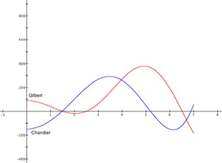
The cities of Gilbert and Chandler each keep track how much
their populations change each day of every month. The blue graph shows an
approximation of the change in Chandler's population each day in the first 6
months of 2006. The red graph shows an approximation of the change in Gilbert's
population each day in the first 6 months of 2006.
The cities' councils are considering merging the two
communities into one. They asked their planning commissions for a graph that
shows how their combined populations would have changed over this same period
of time.
- What
does the point (3,270) represent on the Chandler graph? What does the
point (2,-20) represent on the Gilbert graph? What does 3.2 on the x-axis
represent?
(3,270) represents _________________________________________________
(2,-20) represents _________________________________________________
3.2 on the x-axis represents _________________________________________
- You
are a member of the planning commission. Produce (on the above coordinate
system) an approximate graph of the combined population's daily change
over the first 6 months of 2006.
- During
what periods would the combined population have decreased? Increased?
- Could
you use your new graph to estimate how much the combined population grew
during the first 6 months of 2006? How?